#09 – Tips & tricks for designing and structuring your TeachCenter course (Part 3)
Better overview with text and media areas & Bootstrap
Short description of the learning setting

Institute of Interactive Systems and Data Science
Period: SS22 und WS22
Courses: “Object-Oriented Programming 1“ (OOP1) and “Introduction to Structured Programming“ (German abbreviation: ESP)
Group Size: more than 500 students per course
Delivery method: Flipped Classroom in ESP and online in OOP1

Contact for questions: tc@tugraz.at
TeachCenter courses with many contents and activities tend to become confusing for both students and teachers. In Part 2 (article #08 in the category TeachCenter) we presented a simple method for creating more structure in a TeachCenter course. In this article we extend this method with Bootstrap components. In this way, we not only improve the appearance of our TeachCenter courses, but also provide a better overview.

More information about ways to create more structure in a TeachCenter course can also be found in the TeachCenter category in the article #08 Tips & Tricks for Designing and Structuring your TeachCenter Course (Part 2).
What is Bootstrap?
Bootstrap is a frontend framework that can create versatile graphical elements on a website with just a few lines of HTML. Such elements can be, for example, button groups/buttons, cards and accordions . The only requirement for using Bootstrap elements is a basic knowledge of HTML. We also like to use alerts to highlight important information.
Why Bootstrap components in the TeachCenter?
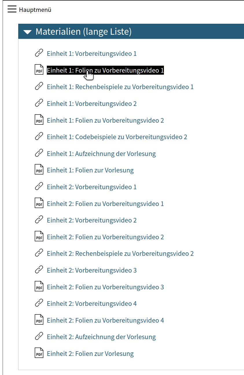
Figure 1 shows a section in the TeachCenter filled with many elements. The links in this example lead to preparation videos (in a flipped classroom setting) and lecture recordings. Additional materials are provided for all videos. Such a list might be difficult to keep track of.
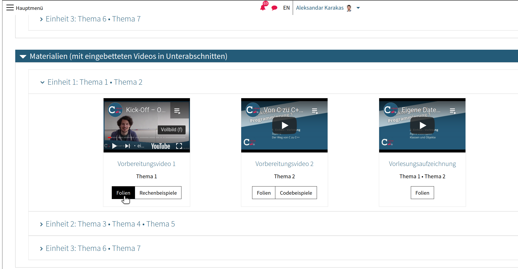
With Bootstrap, such a list can be divided into collapsible parts with a collapsible ”accordion“, where each part can be expanded and collapsed. This makes it possible to hide the contents of past lecture units by collapsing the corresponding parts. This improves the overview without restricting the availability of content. Students who want to access content in a collapsed part can expand it with one click.
Figure 2 shows a revised version of the section in Figure 1, where the materials of each unit are grouped in a separate collapsible. Individual collapsible parts can be expanded and collapsed as desired. Videos have been embedded in each collapsible part so that they can be viewed directly in the TeachCenter.
In addition, students can access all supplementary materials through buttons. We also used Bootstrap to display the individual elements within a collapsible.
The starting point of all our restructuring work is a text and media area, as it already was in Part 2. It is the only component that was used to achieve the desired result through Bootstrap. Bootstrap elements can be used in all places where the text editor is available (e.g. when creating text and media areas, in forums or text pages.) To add Bootstrap elements, you have to switch to the Source Code view of the text editor.
Tips for implementation in your own TeachCenter course
Finally, we would like to give you some advice for using Bootstrap:
- An overview of all Bootstrap components is available online.
- The Bootstrap documentation provides many examples to get a basic overview. The HTML code of these examples can be used in your own TeachCenter course and adapted as you wish.
To insert a basic accordion with expandable subsections, use the following code:
<div id="accordionExample" class="accordion">
<div class="card">
<div id="headingOne" class="card-header">
<h2 class="mb-0"><button class="btn btn-link btn-block text-left"
type="button" data-toggle="collapse" data-target="#collapseOne"
aria-expanded="true" aria-controls="collapseOne"> Collapsible Group
Item #1 </button></h2>
</div>
<div id="collapseOne" class="collapse show" aria-labelledby="headingOne"
data-parent="#accordionExample">
<div class="card-body">Some placeholder content for the first accordion
panel. This panel is shown by default, thanks to the <code>.show</code>
class.</div>
</div>
</div>
</div>
Another option to add simple collapsible sections with HTML is the following code:
<p id="example-simple-details">Details/Summary</p>
<details class="mb-4">
<summary class="h2">
<h2 class="d-inline">Abschnitt 1</h2>
</summary>
<p>In pinyin, each Chinese syllable is spelled in terms of an optional initial
and a final, each of which is represented by one or more letters.</p>
<p>Hanyu Pinyin was developed in the 1950s by a group of Chinese linguists
including Wang Li, Lu Zhiwei, Li Jinxi, Luo Changpei and, particularly, Zhou
Youguang, who has been called the "father of pinyin".</p>
</details>
A third option of creating collapsible sections without using any HTML is to use subsections, which can be added like regular sections.
- The IDs accordion1, header1 and collapse1 used in the code should be unique. That is, there should be no other collapsible sections with the same IDs. Otherwise, clicking on a specific part may unintentionally open or close another part.
- For complex use cases, it may be easier to first edit the HTML code in an editor such as VS Code or Notepad++ and only then paste it into the text editor.

Don't forget: All materials linked via buttons should be hidden for students in the original list. How this works has already been described in part 2 (TC #08).
Licensed under a Creative Commons licence CC BY 4.0 International
 Aleksandar Karakas, Alexander Steinmaurer (Institute of Interactive Systems and Data Science)
